
Unleash the Power of Colors: Creating Harmonious Web Designs
When it comes to designing your website, choosing the right colors goes beyond just eliciting emotional responses. It's equally important to consider how these colors interact with one another, creating a harmonious and visually captivating experience. To achieve this, let's delve into the fascinating world of color theory.
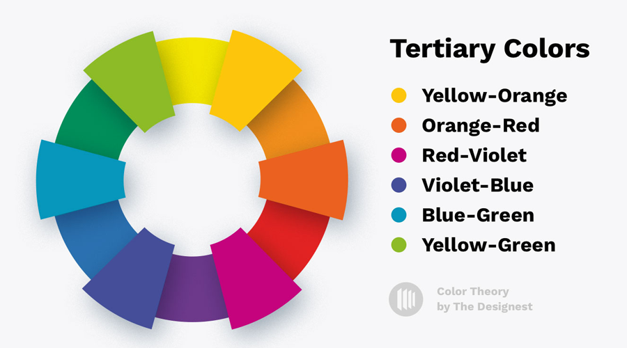
Imagine a color wheel, a fundamental concept in art and design. It illustrates the relationship between primary colors (red, yellow, and blue), and how their combination gives birth to secondary and tertiary colors. The color wheel not only serves as a guide but also empowers you to establish a sense of balance and order through color harmony.
There are three widely accepted color schemes for achieving this harmony: analogous, monochromatic, and complementary.
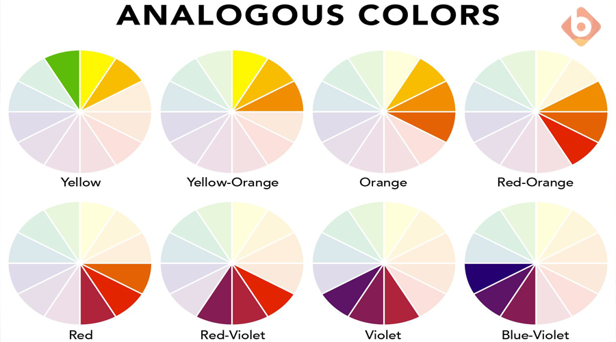
An analogous color scheme involves selecting colors that sit side-by-side on the color wheel. While this palette can be challenging to master, it rewards you with vibrant and engaging designs. Consider these three examples for inspiration:
On the opposite end of the spectrum, we have the monochromatic color scheme. As the name suggests, it consists of variations of a single main color, allowing you to play with intensity and lightness. This palette is both simple and safe, as shades of the same color seldom clash or appear overwhelming. Embrace the elegance of a monochromatic design by exploring these three examples:
Now, imagine a color scheme that strikes a balance between variety and cohesion. Enter the complementary palette, where colors that lie directly opposite each other on the color wheel come together in perfect harmony. By leveraging complementary colors, your website can boast diversity without overwhelming your visitors. Consider these examples for a vibrant yet balanced color scheme:
Of course, the aforementioned color schemes are not the only ones at your disposal. Different designers have varying opinions on the best palettes. One popular alternative is the triadic color scheme, which involves using three colors positioned 120 degrees apart on the color wheel. This dynamic scheme injects energy and visual interest into your website. For example, you can choose colors like orange, green, and purple to create an eye-catching combination.
Remember, the color schemes mentioned here are not strict rules but rather guidelines to help you craft a captivating visual experience for your brand. Feel free to experiment and create your unique palette that aligns with your brand's personality.
Once you've chosen your palette, it becomes a powerful tool to establish a hierarchy of importance for the content on your website. By assigning colors strategically, you can guide visitors' attention to the most crucial elements on each page.
Unleash your creativity and let colors breathe life into your web design, creating a captivating and harmonious digital space that leaves a lasting impression on your audience.
Enhancing Visual Impact: Captivate Your Audience
In the realm of web design, making certain elements stand out is crucial. As mentioned earlier, a carefully curated color palette can serve as a powerful tool for highlighting essential components on your website.
To truly maximize the impact, consider the Isolation Effect while strategizing the implementation of your color scheme across your pages. This psychological principle revolves around the idea that the more an item stands out, the greater the chances of it being noticed and remembered.
When selecting colors, ensure they possess the ability to make specific calls to action pop without clashing with the overall design. By doing so, you can create an eye-catching visual hierarchy that guides your visitors towards the desired actions.
Insights into Consumer Preferences
Interestingly, this approach aligns with the preferences of most consumers. In two enlightening studies, "Aesthetic Response to Color Combinations" and "Consumer Preferences for Color Combinations," researchers discovered intriguing insights.
The first study revealed that consumers generally prefer color combinations with similar shades, as pair preference and harmony increase with hue similarity. However, figural color preference rises as the contrast between the hues and the background intensifies.
Similarly, the second study highlighted that people tend to combine colors that are relatively close or exact matches, with the exception of highlighting a signature product component using a contrasting color.
Therefore, while your accent color should possess a strong contrast, the rest of your palette can consist of shades that are relatively similar. This approach not only isolates key elements effectively but also creates a visually pleasing combination that resonates with many of your website visitors.
In summary, by leveraging a defined color palette, implementing the Isolation Effect, and considering consumer preferences, you can craft a visually stunning web design. These strategies will help certain elements stand out, leaving a lasting impression on your audience and driving desired actions.
write me the following content more interesting and interesting:"Simplify design-related decisions
When it comes to running a website or a business (or both!), it's always a good idea to look for ways to simplify basic processes.
After all, the less time you spend on basic tasks, the more time you'll have to spend on processes and decisions that have a bigger impact on your success.
And establishing web design palettes is a great way to cut down on the time it takes to create new pages. When you have an established color scheme, you make basic design choices much easier, both for yourself and for your designers and developers.
When you create a user-friendly document of your palette, you manufacture an at-a-glance resource with all of the possible options for each element.
This way, if you (or your designers) are having trouble determining which color to use for a CTA button, you can simply reference the document for a complete list of your options.
So instead of racking your brain for all of the various possibilities, you can choose from a pre-set list of colors. And once you select a few to use or test, all of the HEX and RGB codes are already right in front of you.
How many colors should you incorporate?
It all depends on the complexity of your design and the types of color combinations. For instance, if you're using a monochromatic web design palette, you might need seven or even more shades of that color to capture enough variety on the screen.
You'll want to specify colors for specific parts of your site, such as text, backgrounds, links, link hover colors, CTA buttons, and headings".
In conclusion
The right color scheme for your website plays a vital role in creating a visually appealing and engaging user experience. By developing a sense of order and making certain elements stand out, you can effectively guide your visitors' attention and enhance the overall impact of your design.
A well-chosen color palette not only adds aesthetic value but also serves as a powerful tool to highlight important elements and calls to action. Utilizing the Isolation Effect, where standout items are more likely to be noticed and remembered, can significantly improve the effectiveness of your website.
Furthermore, understanding consumer preferences for color combinations can further elevate your design choices. Studies have shown that while consumers generally prefer combinations with similar shades, incorporating a highly contrasting accent color can create a captivating visual effect that draws attention to specific components.
By striking the right balance between uniformity and contrast in your color scheme, you can create a visually harmonious and impactful web design. Remember to consider the preferences of your target audience and align your color choices with your brand identity to establish a strong visual presence.
In conclusion, by carefully selecting and implementing a cohesive color scheme, you can create a website that not only captures attention but also enhances user engagement, leaving a lasting impression on your visitors.