Therefore, choosing the right colors for your marketing and sales strategy is crucial to attract, engage and convert your potential customers.
But how do you know which colors are the best for boosting sales? There is no definitive answer to this question, as different colors may evoke different associations and reactions depending on the context, the audience, the industry and the culture. However, there are some general principles and guidelines that can help you make informed choices based on color psychology, color theory and color harmony.
In this article, we will explore some of the most effective colors for increasing sales and conversions, and how to use them in your marketing materials, website design, product packaging and branding. We will also provide some examples of successful businesses that have leveraged the power of colors to create a memorable and persuasive visual identity.
Red
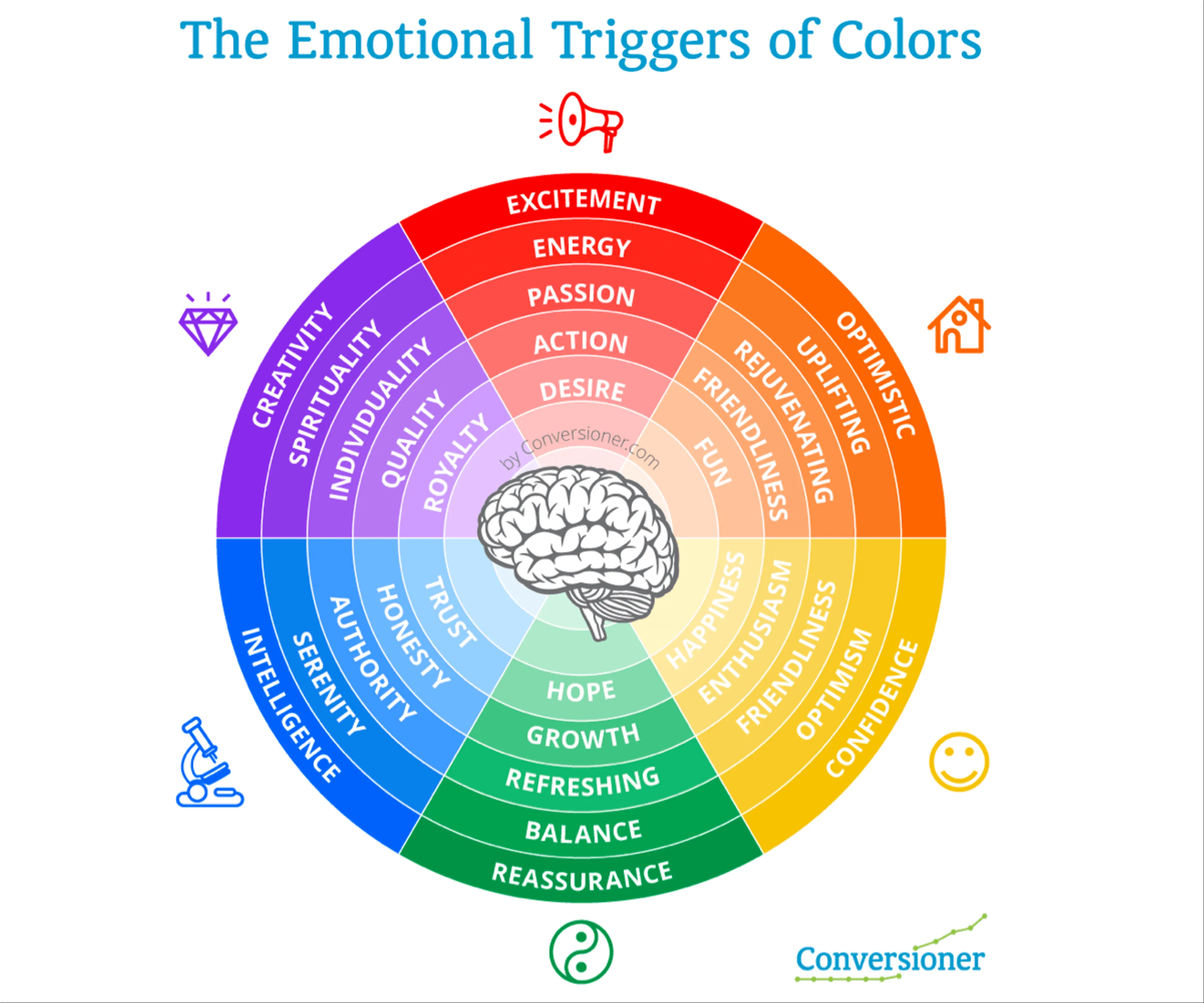
Red is one of the most attention-grabbing and stimulating colors in the spectrum. It is associated with passion, excitement, urgency, energy and action. It can also trigger feelings of hunger, desire, danger and aggression. Red is often used to create a sense of urgency and to motivate customers to take action quickly. For example, red is commonly used for clearance sales, limited-time offers, countdown timers and call-to-action buttons.
Red can also increase appetite and cravings, which is why it is widely used by food and beverage brands such as Coca-Cola, McDonald’s, KFC and Pizza Hut. Red can also enhance the perceived value and quality of a product, as it is associated with luxury, prestige and power. For example, red is often used by high-end fashion brands such as Chanel, Dior, Gucci and Louis Vuitton.

However, red should be used sparingly and strategically, as it can also have negative effects such as increasing anxiety, stress and blood pressure. Red can also create a sense of competition and hostility, which may not be suitable for some industries or audiences. Therefore, red should be balanced with other colors that can soften its intensity and create contrast.
Blue
Blue is one of the most popular and trusted colors in the world. It is associated with calmness, tranquility, reliability, professionalism and security. It can also evoke feelings of loyalty, confidence, intelligence and authority. Blue is often used to convey trustworthiness and credibility, which is why it is widely used by banks, insurance companies, technology firms and social media platforms such as PayPal, Visa, IBM, Facebook and Twitter.
Blue can also stimulate creativity and productivity, which is why it is often used in office environments and educational settings. Blue can also promote relaxation and well-being, which is why it is often used by health care providers, spas and wellness centers. Blue can also appeal to a wide range of customers across different genders, ages and cultures.
However, blue should be avoided or used carefully in some cases where it may have negative connotations or effects. For example, blue can also represent coldness, sadness or depression in some contexts. Blue can also suppress appetite and reduce energy levels in some people. Therefore, blue should be combined with other colors that can add warmth or excitement to your message.
Maybe you are interested: The sales letters every marketer should know
Yellow
Yellow is one of the most cheerful and optimistic colors in the spectrum. It is associated with happiness, joy, Yellow is one of the most cheerful and optimistic colors in the spectrum. It is associated with happiness, joy, sunshine, warmth and positivity. It can also stimulate curiosity, creativity and mental activity. Yellow is often used to capture attention and to create a positive and friendly impression. For example, yellow is commonly used for signs, logos, headlines and highlights.
Yellow can also increase sales and conversions by creating a sense of urgency and excitement. For example, yellow is often used for discounts, deals, freebies and guarantees. Yellow can also enhance the perceived value and quality of a product, as it is associated with gold, luxury and prestige. For example, yellow is often used by premium brands such as Ferrari, Rolex and Tiffany & Co.
However, yellow should be used moderately and carefully, as it can also have negative effects such as causing eye strain, fatigue and irritation. Yellow can also represent caution, cowardice or deceit in some contexts. Therefore, yellow should be balanced with other colors that can reduce its brightness and create harmony.
Green
Green is one of the most natural and soothing colors in the spectrum. It is associated with nature, health, growth, freshness and harmony. It can also evoke feelings of peace, balance, stability and prosperity. Green is often used to convey environmental friendliness and social responsibility, which is why it is widely used by organic, eco-friendly and sustainable brands such as Whole Foods, Starbucks and The Body Shop.
Green can also increase sales and conversions by creating a sense of trust and safety. For example, green is often used for money, security, guarantees and testimonials. Green can also stimulate positive emotions and associations, which can influence purchasing decisions. For example, green can represent health, wellness, vitality and happiness.
However, green should be avoided or used carefully in some cases where it may have negative connotations or effects. For example, green can also represent envy, jealousy or greed in some contexts. Green can also reduce appetite and cravings in some people. Therefore, green should be matched with other colors that can complement its meaning and effect.

Orange
Orange is one of the most vibrant and energetic colors in the spectrum. It is a combination of red and yellow, and it inherits some of their qualities. It is associated with warmth, enthusiasm, fun, creativity and adventure. It can also trigger feelings of hunger, appetite, excitement and urgency. Orange is often used to attract attention and to create a playful and lively impression. For example, orange is commonly used for buttons, icons, badges and banners.
Orange can also increase sales and conversions by creating a sense of urgency and action. For example, orange is often used for limited-time offers, discounts, free trials and subscriptions. Orange can also enhance the perceived value and quality of a product, as it is associated with innovation, uniqueness and originality. For example, orange is often used by creative and cutting-edge brands such as Amazon, Fanta and Nickelodeon.
However, orange should be used moderately and carefully, as it can also have negative effects such as causing anxiety, frustration and irritation. Orange can also represent cheapness, immaturity or lack of professionalism in some contexts. Therefore, orange should be balanced with other colors that can tone down its intensity and create contrast.
Maybe you are interested: Multichannel Content Marketing: Building a Successful Multimedia Campaign
Purple
Purple is one of the most mysterious and elegant colors in the spectrum. It is a combination of red and blue, and it inherits some of their qualities. It is associated with royalty, luxury, sophistication and spirituality. It can also evoke feelings of creativity, imagination, wisdom and inspiration. Purple is often used to convey a sense of quality and exclusivity, and to create a distinctive and memorable impression. For example, purple is commonly used for logos, headlines and backgrounds.
Purple can also increase sales and conversions by creating a sense of value and prestige. For example, purple is often used for premium products, services and memberships. Purple can also enhance the perceived value and quality of a product, as it is associated with innovation, uniqueness and originality. For example, purple is often used by creative and cutting-edge brands such as Cadbury, Yahoo and Twitch.
However, purple should be avoided or used carefully in some cases where it may have negative connotations or effects. For example, purple can also represent arrogance, aloofness or extravagance in some contexts. Purple can also reduce energy levels and appetite in some people. Therefore, purple should be matched with other colors that can complement its meaning and effect
Pink
Pink is one of the most feminine and romantic colors in the spectrum. It is a variation of red, and it inherits some of its qualities. It is associated with love, sweetness, tenderness and charm. It can also evoke feelings of innocence, playfulness, fun and excitement. Pink is often used to convey a sense of softness and delicacy, and to create a warm and inviting impression. For example, pink is commonly used for logos, headlines and backgrounds.
Pink can also increase sales and conversions by creating a sense of emotion and connection. For example, pink is often used for products, services and causes that appeal to women, children and social groups. Pink can also enhance the perceived value and quality of a product, as it is associated with beauty, elegance and sophistication. For example, pink is often used by beauty and fashion brands such as Victoria’s Secret, Barbie and Cosmopolitan.
However, pink should be avoided or used carefully in some cases where it may have negative connotations or effects. For example, pink can also represent immaturity, weakness or frivolity in some contexts. Pink can also alienate some customers who may not identify with its gendered or stereotypical associations. Therefore, pink should be balanced with other colors that can add diversity and contrast.
Conclusion
Colors are powerful tools that can influence your customers’ emotions, perceptions, behaviors and decisions. By choosing the right colors for your marketing and sales strategy, you can boost your sales and conversions, and create a strong and lasting impression on your potential customers.
However, there is no one-size-fits-all solution when it comes to colors. Different colors may have different effects depending on the context, the audience, the industry and the culture. Therefore, you should always test and experiment with different color combinations and variations to find the best fit for your brand and your goals.
Remember, colors are not just visual elements, they are also psychological and emotional triggers that can make or break your sales success. Use them wisely and strategically, and you will see the results. Good luck!
