In web development and design, the margin of an element represents the outside space of the element itself, while the padding represents the inner space surrounding the element. It’s important to understand how different components, such as padding and margins, come together to separate text and graphics. Doing so encourages you to create a website that looks clean and is easy to read.
If you’re interested in learning more about what padding and margins are and how they’re used, this guide will cover everything you need to know.
Padding vs. margin explained
When developing a website, padding and margin are essential to ensuring your website's design is uncluttered and sleek. They can also help the loading speed of your website and establish uniformity across all devices and browsers.

What is padding?
Padding is the space between the content and the border of an element. Padding is valuable in making additional space inside an element, keeping it at a set distance from other aspects of a website. Using padding is extremely beneficial when you need to separate text boxes and images while also keeping them aligned.
What is margin?
Margin is the space around the border of an element. The margin surrounding an element will inform the web browser being used of how much space should be left between independent elements and the external margin of the website's page. Margins can also be used to keep different elements an equal distance apart.
Before you begin building any type of website, it’s best to familiarize yourself with the differences and similarities of padding vs. margin to ensure you implement the proper settings for each and use them correctly.
Once you learn the difference between padding vs. margin, you can determine the best method of incorporating both into your own website's layout and design.
Keep the following differences between padding and margins in mind:

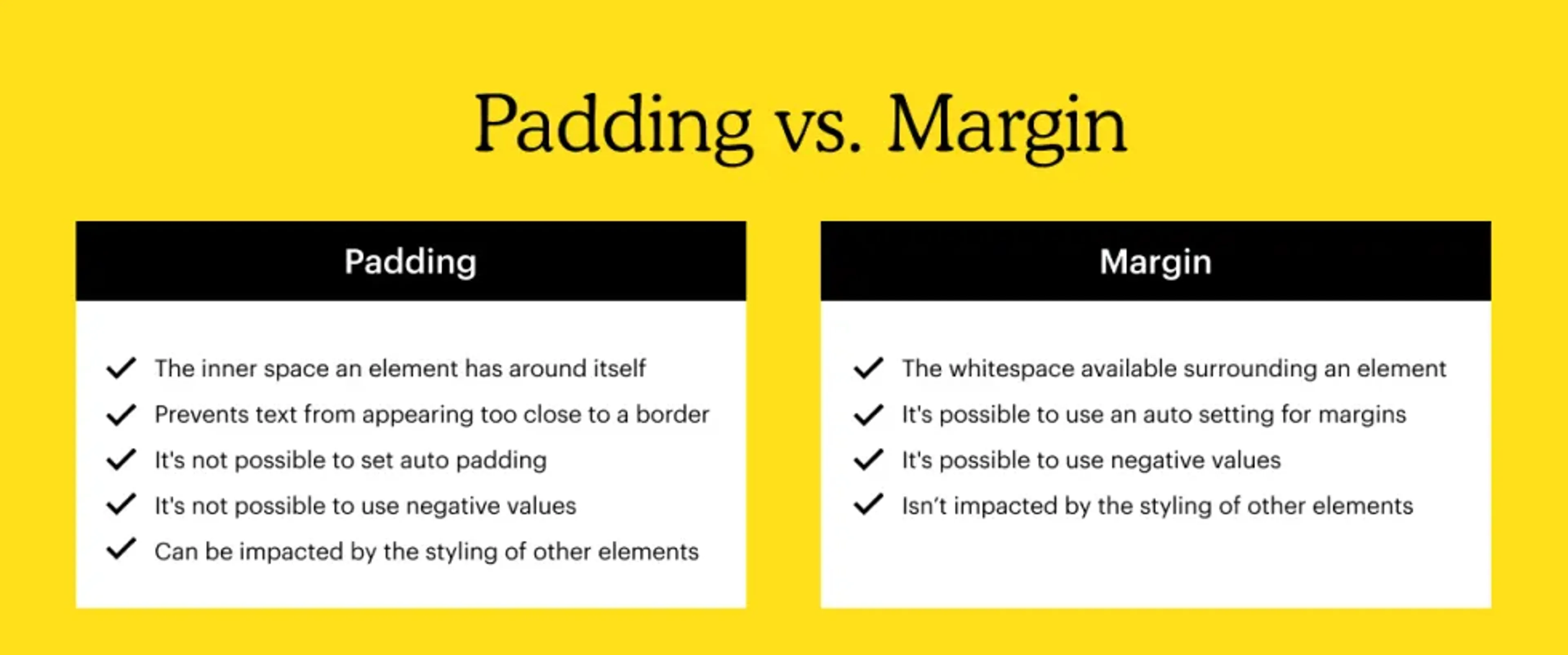
- Padding represents the amount of inner space an element has, while the margin is whitespace available surrounding an element.
- It’s not possible to set padding to auto padding. However, you can use automatic settings for margins.
- It’s not possible to use negative values when defining padding, but you can with margins.
- Padding can be impacted by the styling of other elements on a website. Margin won’t be impacted by the stylization of other elements on a website.
When to use padding vs. margin
It's essential to know when to use padding vs. margin as you build your website. Once you're familiar with the differences between margin and padding, it'll be easier to determine when it's the right time to implement margins on a page and when you should use padding.
Before you begin your website development project, here are a few things about padding and margins to keep in mind.
When to use padding:
- Change the size of an element. If you want to expand the space around an element, you can add or increase the padding surrounding it. This can be useful when working with interactive items, such as buttons or image-based links.
- Add space between borders and content. Using padding to add space between content and its corresponding border is one way to ensure the design aligns with other on-page elements. Doing so can help you increase the whitespace of your graphic or website, which is fundamental in web design.
When to use margins:
- Adjust an element's positioning. One of the most common reasons to use margins when designing and developing a site is to change a specific element's position. Using margins can help you move an element based on whether you prefer it to be centered on your page or positioned to the right or left. You can also choose if the element is fixed and will scroll along the page or if it should remain in one place as a user scrolls.
- Overlap elements. If you want to overlap specific elements with one another, you can do so using margins. Using a negative margin value is one of the quickest ways to allow elements to overlap with one another.
- Setting distance. Setting the distance between elements is much easier once you're familiar with margins and how they work. Incorporating the right amount of whitespace can mean the difference between building an attractive website thriving with traffic and turning prospective customers away.
