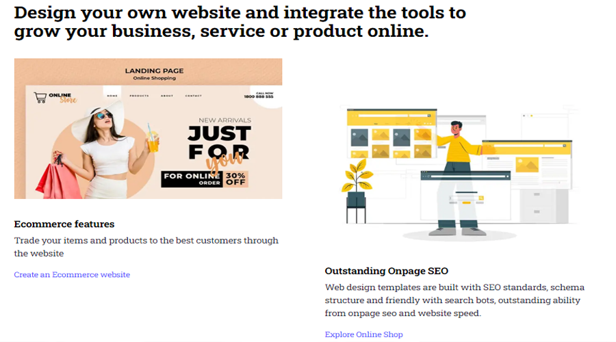
A landing page is a website page with a specific purpose: to convert visitors into leads or customers. It is often the first impression that a potential customer has of your brand, product or service, and therefore it needs to be designed and written in a way that captures their attention and persuades them to take action.
But how do you create a landing page that does all that? What are the elements and principles that make a landing page effective and high-converting? In this essay, we will explore the anatomy of a successful landing page, and reveal some of the best practices that you can apply to your own landing pages.

Above the Fold Elements
The term “above the fold” refers to the part of the landing page that is visible without scrolling. This is the most important section of your landing page, as it is where you need to grab your visitors’ attention and communicate your value proposition.
According to HubSpot, some of the essential elements that you should include above the fold are:
- A benefit-focused headline. Your headline should clearly state what your offer is and how it can help your visitors solve their problems or achieve their goals. It should be concise, compelling and relevant to your target audience.
- An image that illustrates the offer. A picture is worth a thousand words, and a good image can help you convey your message and evoke emotions in your visitors. The image should be relevant to your offer, high-quality and eye-catching. It can be a photo, an illustration, a screenshot or a video.
- A lead form. This is where you ask your visitors for their contact information in exchange for your offer. The lead form should be visible above the fold, so that your visitors don’t have to scroll down to find it. It should also be simple and easy to fill out, asking only for the information that you need to qualify and follow up with your leads.
- A clear and standout call-to-action (CTA). This is the button that tells your visitors what action you want them to take on your landing page. It should be prominent, contrasting and actionable. It should also use clear and specific language that matches your offer and creates urgency.
Content
Below the fold, you can provide more information and details about your offer and why your visitors should take action. The content of your landing page should support your headline and CTA, and address any questions or objections that your visitors might have.

According to Elementor, some of the best practices for writing landing page content are:
- Write concise headlines. Your headlines should be short and catchy, and highlight the main benefits or features of your offer. They should also break up your content into scannable sections that guide your visitors through your landing page.
- Make your landing page engaging. You can use storytelling, testimonials, social proof, statistics or other elements to make your landing page more interesting and persuasive. You can also use multimedia elements such as videos, animations or interactive features to enhance your content and increase engagement.
- Build forms with user experience (UX) in mind. Your forms should be easy to use and understand, and not ask for too much information or require too many steps. You can also use features such as autofill, validation or progress indicators to improve UX and increase conversions.
Conversion Elements
Besides the content, there are other elements that you can use on your landing page to boost conversions. These are elements that help you build trust, credibility and authority with your visitors, and overcome any friction or hesitation that they might have.
According to Unbounce, some of the conversion elements that you can use on your landing page are:
- Trust indicators. These are elements that show that you are a legitimate and reputable business or brand, such as logos of customers or partners, awards or certifications, ratings or reviews, press mentions or testimonials.
- Social proof. These are elements that show that other people have used or endorsed your offer, such as case studies, success stories, customer quotes or testimonials, social media posts or comments, number of users or customers, etc.
- Guarantees or assurances. These are elements that show that you stand behind your offer and reduce the risk for your visitors, such as money-back guarantees, free trials or demos, security badges or seals, privacy policies or terms of service.
Footer
The footer is the last section of your landing page, and it is where you can provide some additional information or links that might be useful or relevant for your visitors. However, you should be careful not to include anything that might distract or confuse your visitors, or take them away from your landing page.
Some of the elements that you can include in your footer are:
- Contact information. This is where you can provide your phone number, email address, physical address or social media links, in case your visitors want to get in touch with you or follow you online.
- Navigation links. These are links to other pages on your website, such as your homepage, about page, blog or resources. However, you should only include these links if they are relevant and helpful for your visitors, and not if they might divert them from your landing page goal.
- Disclaimer or disclosure. This is where you can provide any legal or ethical information that might be required or expected for your offer, such as terms and conditions, privacy policy, refund policy, affiliate disclosure, etc.
- What is a landing page? What is the difference between a website and a landing page?
The Free Website Builder Webfity
Now that we have covered the anatomy of a high-converting landing page and some of the best practices for creating one, let’s see how we can apply them to a specific example: the free website builder Webfity.
Webfity is a platform that allows anyone to create a professional and beautiful website in minutes, without any coding or design skills. It offers hundreds of templates, drag-and-drop functionality, SEO optimization and more.
Let’s imagine that we want to create a landing page for Webfity that targets people who want to create a website for their personal or professional projects. Here is how we could structure our landing page using the elements and principles that we have discussed:
Above the Fold Elements
- Headline: Create a Stunning Website in Minutes with Webfity
- Image: A screenshot of a website created with Webfity
- Lead form: A simple form that asks for the visitor’s name and email address
- CTA: Start Your Free Trial Now
Content
Headline: Why Choose Webfity?
Content: A list of the main features and benefits of Webfity, such as:
- No coding or design skills required
- Hundreds of templates for any niche or industry
- Drag-and-drop functionality for easy customization
- SEO optimization for higher rankings and traffic
- Responsive design for mobile devices
- Free hosting and domain name
- 24/7 customer support
Headline: How It Works
Content: A video or animation that shows how easy it is to create a website with Webfity in three simple steps:
- Choose a template
- Customize it with your content and images
- Publish it online
Conversion Elements
- Trust indicators: Logos of some of the customers or partners that use Webfity, such as bloggers, freelancers, entrepreneurs, etc.
- Social proof: Testimonials from some of the satisfied users of Webfity, highlighting how Webfity helped them create their websites quickly and easily.
- Guarantees or assurances: A money-back guarantee that states that if the visitor is not happy with their website within 30 days, they can get a full refund. A security badge that shows that Webfity uses SSL encryption to protect the visitor’s data.
Footer
- Contact information: A phone number and an email address for customer support
- Navigation links: Links to the homepage, about page and blog of Webfity
- Disclaimer or disclosure: A link to the terms and conditions and privacy policy of Webfity
Conclusion
In this essay, we have explored the anatomy of a high-converting landing page and revealed some of the best practices for creating one. We have also applied these principles to a specific example: the free website builder Webfity.
By following these guidelines, you can create landing pages that capture your visitors’ attention, communicate your value proposition and persuade them to take action. However, remember that these are not fixed rules, but rather starting points for experimentation. You should always test and optimize your landing pages based on your own data and feedback from your customers.
We hope that this essay has been helpful and informative for you. If you want to learn more about landing pages or Webfity, feel free to contact us or visit our website. Thank you for reading!
