
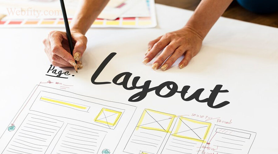
A website builder layout is the way you arrange the elements on your web page, such as text, images, videos, buttons, and so on. A good website layout can help you communicate your message effectively, attract visitors’ attention, and guide them to take action.
But how do you choose the right website layout for your site? And what are some of the best website layout ideas that you can use as inspiration? In this article, we will answer these questions and show you some examples of great website layouts that you can apply to your own site.
What is a website builder layout?
A website builder layout is the structure and organization of the content on your web page. It defines how the different elements are positioned and aligned, how they interact with each other, and how they fit into the overall design of your site.
A website builder layout can be created using various tools and techniques, such as HTML, CSS, grid systems, frameworks, templates, and drag-and-drop builders. Depending on your level of skill and preference, you can choose the tool that suits you best.
There are some common principles and best practices that you should follow when creating a website layout.
- Consistency: Your website layout should be consistent across all pages of your site. This means using the same colors, fonts, styles, navigation, and branding throughout your site. This will help you create a coherent and professional look and feel for your site and make it easier for visitors to navigate and recognize your site.
- Simplicity: Your website builder layout should be simple and clear. This means avoiding cluttering your page with too many elements or unnecessary information. Instead, you should focus on the most important content and use whitespace to create breathing room and contrast. This will help you avoid overwhelming or confusing your visitors and make your content more readable and engaging.
- Hierarchy: Your website layout should have a clear hierarchy of information. This means organizing your content into logical sections and sub-sections and using headings, subheadings, lists, bullets, and other visual cues to indicate the level of importance and relevance of each element. This will help you communicate your message effectively and guide your visitors to the information they are looking for.
- Balance: Your website layout should have a balanced distribution of elements. This means ensuring that your page is not too heavy or too light on either side, top, or bottom. Instead, you should use symmetry or asymmetry to create a harmonious and aesthetically pleasing layout. This will help you create a sense of stability and order for your site and make it more appealing to your visitors.
- Responsiveness: Your website layout should be responsive to different screen sizes and devices. This means ensuring that your page adapts to the width and height of the browser window and that the elements resize, reposition, or rearrange accordingly. This will help you provide a consistent and optimal user experience for your visitors regardless of the device they use to access your site.
How to choose the right website layout
Choosing the right website layout for your site depends on several factors, such as:
- Your goal: What is the purpose of your site? What do you want to achieve with it? What action do you want your visitors to take? Your goal will determine the type and amount of content you need to include on your page and the way you need to present it.
- Your audience: Who are your target visitors? What are their needs, preferences, and expectations? How do they behave online? Your audience will determine the tone, style, and language of your content and the level of interactivity and functionality you need to provide on your page.
- Your content: What kind of content do you have or plan to create for your site? How much content do you have or plan to have? How complex or simple is your content? Your content will determine the layout options and limitations you have and the best way to organize and display your content.
Based on these factors, you can choose a website layout that suits your site best. However, there are some general guidelines that you can follow to make this process easier:
- Accommodate your content: Your website layout should fit your content, not the other way around. This means that you should not force your content into a predefined layout that does not suit it. Instead, you should create a custom layout that accommodates your content and showcases it in the best possible way.
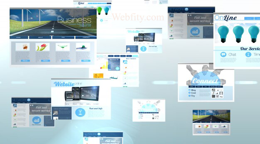
- Use common layouts: While you can create a unique and original layout for your site, sometimes it is better to use common layouts that are familiar and proven to work. These are layouts that are widely used and accepted by web designers and users alike, such as the Z-pattern, the F-pattern, the fullscreen image, the split screen, and so on. These layouts can help you save time and effort and ensure that your site follows the web standards and conventions.
- Website Builder vs. Web Designer: Which is Best for Your Business?
Best website layout ideas
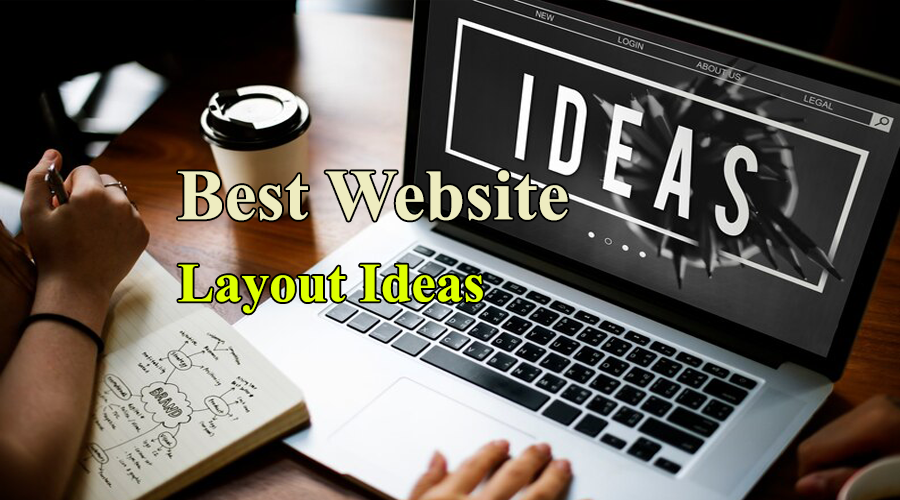
o give you some inspiration and examples of how to apply these guidelines, here are some of the best website layout ideas that you can use for your site:
Z-pattern layout
The Z-pattern layout is a layout that follows the shape of the letter Z. It is suitable for pages that have a simple goal and a minimal amount of content, such as landing pages, home pages, or portfolios. The Z-pattern layout guides the visitors’ eyes from the top left to the top right, then diagonally to the bottom left, and then horizontally to the bottom right of the page. This way, it captures the visitors’ attention and leads them to the most important elements on the page, such as the logo, the headline, the call-to-action, and the social media icons.
An example of a website that uses the Z-pattern layout is Airbnb. As you can see, the page has a clear goal: to get visitors to search for a place to stay. The page has a minimal amount of content: a logo, a headline, a search box, and some images. The page follows the Z-pattern layout: it starts with the logo on the top left, then moves to the headline on the top right, then diagonally to the search box on the bottom left, and then horizontally to some images on the bottom right.
F-pattern layout
The F-pattern layout is a layout that follows the shape of the letter F. It is suitable for pages that have a lot of content and information, such as blogs, news sites, or e-commerce sites. The F-pattern layout guides the visitors’ eyes from the top left to the top right, then vertically down along the left side of the page, and then horizontally across the page. This way, it captures the visitors’ attention and leads them to scan the most important elements on the page, such as the logo, the navigation menu, the headlines, and the images.
An example of a website that uses the F-pattern layout is Amazon. As you can see, the page has a lot of content and information: a logo, a navigation menu, a search box, a banner, a sidebar, and a list of products. The page follows the F-pattern layout: it starts with the logo on the top left, then moves to the navigation menu and the search box on the top right, then vertically down along the left side of the page to the sidebar, and then horizontally across the page to the banner and the list of products.
Fullscreen image layout
The fullscreen image layout is a layout that uses a large and high-quality image that covers the entire screen as the background of the page. It is suitable for pages that have a strong visual appeal and a simple goal, such as portfolios, galleries, or product pages. The fullscreen image layout creates a stunning and immersive effect that draws the visitors’ attention and showcases the main feature or benefit of the site. The fullscreen image layout usually has a minimal amount of content on top of the image, such as a logo, a headline, or a call-to-action.
An example of a website that uses the fullscreen image layout is Apple. As you can see, the page has a strong visual appeal and a simple goal: to promote the latest iPhone. The page uses a large and high-quality image of the iPhone that covers the entire screen as the background of the page. The page has a minimal amount of content on top of the image: a logo, a headline, and a call-to-action.
Split screen layout
The split screen layout is a layout that divides the screen into two equal or unequal parts, usually vertically or horizontally. It is suitable for pages that have two main elements or features that need to be highlighted or compared, such as products, services, or categories. The split screen layout creates a contrast and balance between the two parts and allows the visitors to choose or switch between them easily.
An example of a website that uses the split screen layout is Spotify. As you can see, the page has two main elements: Spotify Free and Spotify Premium. The page divides the screen into two equal parts vertically: one for Spotify Free and one for Spotify Premium. The page creates a contrast between the two parts by using different colors and images. The page also allows the visitors to switch between them by using tabs on the top.
Asymmetrical layout
The asymmetrical layout is a layout that uses an uneven distribution of elements on the page. It is suitable for pages that have a creative and dynamic appeal and a complex or diverse content, such as portfolios, magazines, or blogs. The asymmetrical layout creates a sense of movement and interest that attracts the visitors’ attention and showcases the variety and uniqueness of the site. The asymmetrical layout usually uses different sizes, shapes, colors, and positions of the elements to create a balance and harmony on the page.
An example of a website that uses the asymmetrical layout is Medium. As you can see, the page has a creative and dynamic appeal and a complex and diverse content: a logo, a navigation menu, a search box, a banner, and a list of articles. The page uses an uneven distribution of elements on the page: some elements are larger or smaller, some are aligned to the left or right, some are overlapping or separated, and some are colorful or monochrome. The page creates a balance and harmony on the page by using whitespace and grids.
Single column layout
The single column layout is a layout that uses one main column to display the content on the page. It is suitable for pages that have a clear and linear flow of information and a minimal or focused content, such as articles, guides, or tutorials. The single column layout creates a sense of clarity and simplicity that enhances the readability and comprehension of the content. The single column layout usually uses headings, subheadings, images, and other visual cues to break up the content into manageable chunks.
An example of a website that uses the single column layout is Wikipedia. As you can see, the page has a clear and linear flow of information and a minimal or focused content: a logo, a navigation menu, a search box, and an article. The page uses one main column to display the content on the page. The page uses headings, subheadings, images, and other visual cues to break up the content into manageable chunks.
Box-based layout
The box-based layout is a layout that uses boxes or containers to organize and display the content on the page. It is suitable for pages that have a structured and modular content and a lot of elements or features, such as dashboards, e-commerce sites, or social media sites. The box-based layout creates a sense of order and organization that makes the content easy to scan and navigate. The box-based layout usually uses grids, borders, shadows, and colors to create and differentiate the boxes or containers.
An example of a website that uses the box-based layout is Facebook. As you can see, the page has a structured and modular content and a lot of elements or features: a logo, a navigation menu, a search box, a sidebar, a news feed, a chat box, and so on. The page uses boxes or containers to organize and display the content on the page. The page uses grids, borders, shadows, and colors to create and differentiate the boxes or containers.
Cards layout
The cards layout is a layout that uses cards or tiles to organize and display the content on the page. It is suitable for pages that have a diverse and dynamic content and a lot of items or options, such as portfolios, galleries, or product pages. The cards layout creates a sense of variety and interactivity that invites the visitors to explore and discover the content. The cards layout usually uses images, icons, text, and buttons to create and present the cards or tiles.
An example of a website that uses the cards layout is Pinterest. As you can see, the page has a diverse and dynamic content and a lot of items or options: a logo, a navigation menu, a search box, and a list of pins. The page uses cards or tiles to organize and display the content on the page. The page uses images, icons, text, and buttons to create and present the cards or tiles.
Magazine layout
The magazine layout is a layout that mimics the style and format of a print magazine. It is suitable for pages that have a rich and editorial content and a lot of stories or topics, such as blogs, news sites, or magazines. The magazine layout creates a sense of professionalism and elegance that enhances the credibility and appeal of the content. The magazine layout usually uses large and bold headlines, images, captions, and columns to create and layout the content.
An example of a website that uses the magazine layout is The New Yorker. As you can see, the page has a rich and editorial content and a lot of stories or topics: a logo, a navigation menu, a search box, a banner, and a list of articles. The page mimics the style and format of a print magazine. The page uses large and bold headlines, images, captions, and columns to create and layout the content.
Horizontal strips layout
The horizontal strips layout is a layout that uses horizontal sections or strips to organize and display the content on the page. It is suitable for pages that have a sequential and narrative content and a lot of information or features, such as landing pages, home pages, or product pages. The horizontal strips layout creates a sense of progression and storytelling that guides the visitors through the content. The horizontal strips layout usually uses different colors, images, backgrounds, and animations to create and distinguish the sections or strips.
An example of a website that uses the horizontal strips layout is Slack. As you can see, the page has a sequential and narrative content and a lot of information or features: a logo, a navigation menu, a headline, a call-to-action, and several sections. The page uses horizontal sections or strips to organize and display the content on the page. The page uses different colors, images, backgrounds, and animations to create and distinguish the sections or strips.
Conclusion
Choosing the right website layout for your site is an important decision that can affect the success and performance of your site. A good website layout can help you communicate your message effectively, attract visitors’ attention, and guide them to take action.
Creating a captivating and functional website no longer requires significant financial investment or technical expertise. With the abundance of free website builders available today, you can unleash your creativity and establish an online presence that stands out. By leveraging recommended layout ideas like clean and minimalist designs, bold and eye-catching homepages, responsive and mobile-friendly layouts, intuitive menus, and visually stunning galleries, you'll be well on your way to creating a website that captivates your audience and achieves your goals. So, let's dive into the world of free website builders and bring your online vision to life!