However, not all landing pages are created equal. Some landing pages are more effective than others at achieving their goals and delivering value to the visitors. In this essay, we will explore some of the landing page best practices that can help you create high-converting pages that attract and retain your target audience.
Above the Fold Elements
The above the fold area is the part of the landing page that is visible without scrolling down. It is the first impression that visitors get when they land on your page, so it needs to be clear, compelling, and relevant.
Some of the essential elements that should be included in the above the fold area are:
- A benefit-focused headline. The headline is the most important element of your landing page, as it captures the attention and interest of your visitors. It should communicate the main benefit or value proposition of your offer, and answer the question: “What’s in it for me?” For example, “Learn How to Design Effective Landing Pages in 8 Easy Steps” or “Get Your Free Trial of the Best Landing Page Builder Today”.

- An image or video that illustrates the offer. A picture is worth a thousand words, and a video is worth even more. An image or video can help you showcase your offer, demonstrate how it works, or evoke an emotion that relates to your offer. It should be relevant, high-quality, and appealing to your audience. For example, if you are offering an ebook on landing page design, you can use an image of the ebook cover or a video of someone flipping through its pages.
- A compelling copy. The copy is the text that accompanies your headline and image or video. It should provide more details about your offer, highlight its features and benefits, and address any potential objections or questions that your visitors might have. It should also use clear and persuasive language that speaks to your audience’s pain points, desires, and motivations. For example, “This ebook will teach you everything you need to know about landing page design, from choosing the right layout and colors to writing captivating headlines and CTAs. You’ll also get access to 10 ready-made templates that you can use for any niche or industry.”
- A lead form above the fold. A lead form is a form that asks visitors for their contact information in exchange for your offer. It should be placed above the fold so that visitors can see it without scrolling down. It should also be simple and easy to fill out, asking only for the information that you need to follow up with them later. For example, “Enter your name and email address below to get instant access to your free ebook.”
Conversion Elements
The conversion elements are the parts of your landing page that encourage visitors to take action and complete your desired goal. They include:
- A clear and standout call-to-action (CTA). A CTA is a button or link that tells visitors what action you want them to take next. It should be visible, prominent, and contrast with the rest of the page. It should also use action-oriented words that convey urgency and value. For example, “Download Your Free Ebook Now” or “Start Your Free Trial Today”.
- A relevant offer. An offer is what you are giving away in exchange for your visitors’ contact information or purchase. It should be relevant to your audience’s needs and interests, and match their stage in the buyer’s journey. It should also be valuable enough to justify their action and overcome their hesitation. For example, if you are targeting people who are looking for landing page design tips, you can offer them an ebook on that topic or a free consultation with an expert.
- Social proof. Social proof is any evidence that shows that other people have used and liked your offer or brand. It can include testimonials, reviews, ratings, case studies, logos of trusted clients or partners, awards or certifications, or social media mentions. Social proof can help you build trust and credibility with your visitors, and show them that they are not alone in their decision. For example, “See what our happy customers have to say about our landing page builder” or “Join over 10,000 businesses who trust us with their landing pages”.
Footer
The footer is the bottom part of your landing page that contains additional information or links that might be useful or relevant to your visitors. It can include:
- A privacy policy or disclaimer. A privacy policy or disclaimer is a statement that explains how you collect, use, and protect your visitors’ personal information, or any terms and conditions that apply to your offer or service. It can help you comply with the law and reassure your visitors that their data is safe and secure. For example, “We respect your privacy and will never spam you or share your information with anyone” or “This offer is valid for a limited time only and subject to availability”.
- A navigation menu. A navigation menu is a list of links that allows visitors to explore other pages on your website or learn more about your brand. It can help you provide more value and information to your visitors, and keep them engaged with your content. However, it can also distract them from your main goal and reduce your conversion rate. Therefore, you should use a navigation menu sparingly and only include the most relevant or essential links. For example, “About Us”, “Contact Us”, “Blog”, or “FAQ”.
- A secondary CTA. A secondary CTA is an alternative action that you want your visitors to take if they are not ready or willing to take your primary action. It can help you capture more leads, nurture them further, or offer them another option that might suit them better. For example, “Not ready to buy yet? Sign up for our newsletter and get more tips and tricks on landing page design” or “Don’t want to download the ebook? Watch our free webinar instead”.
Landing Page Design Best Practices
Now that we have covered the main elements of a landing page, let’s look at some of the best practices for designing a landing page that converts.
- Keep your landing page simple. A simple landing page is one that has a clear and focused goal, a minimal and consistent design, and a smooth and intuitive user experience. A simple landing page can help you avoid confusion, distraction, and frustration for your visitors, and make it easier for them to understand and appreciate your offer and value proposition. To keep your landing page simple, you should use whitespace, bullet points, headings, subheadings, and images to break up your text and organize your information; use colors, fonts, and icons that match your brand identity and tone; and use visual cues, such as arrows, pointers, or animations, to guide your visitors’ attention and eye movement.

- Show your customers that you can be trusted. Trust is one of the most important factors that influence your visitors’ decision to convert or not. Trust can be established by showing your visitors that you are credible, reliable, and reputable in your field or industry. To show your customers that you can be trusted, you should use social proof, as mentioned above; display trust badges or seals, such as security logos, guarantees, or endorsements; and provide contact information or customer support options, such as phone numbers, email addresses, live chat, or social media accounts.
- Write concise headlines. Headlines are the first thing that your visitors read when they land on your page, so they need to be concise and catchy. Concise headlines are ones that convey the main benefit or value proposition of your offer in a few words, without being vague or generic. Catchy headlines are ones that spark curiosity, emotion, or interest in your visitors, without being misleading or sensationalist. To write concise headlines, you should use clear and specific language that addresses your audience’s pain points or desires; use power words or phrases that evoke positive or negative feelings; and use numbers, statistics, questions, or statements to make your headlines more compelling.
- Optimize your CTAs. CTAs are the final push that persuade your visitors to take action and complete your goal. Therefore, they need to be optimized for maximum impact and effectiveness. To optimize your CTAs,
you should:
Use action-oriented words that tell your visitors exactly what they need to do next
Use words that convey urgency and value
Use colors that contrast with the rest of the page
Use shapes and sizes that stand out
Use whitespace around the CTA button
Use only one CTA per landing page
Place the CTA above the fold
Test different variations of the CTA text
Make your landing page engaging. An engaging landing page is one that keeps your visitors interested and motivated throughout their journey on the page. An engaging landing page can help you reduce bounce rates, increase dwell time, and improve conversions. To make your landing page engaging, you should:
Use images or videos that capture attention
Use storytelling techniques to connect with emotions
Use interactive elements such as quizzes, polls, sliders
Use gamification elements such as rewards points
Use personalization elements such as dynamic content
Use humor elements such as jokes
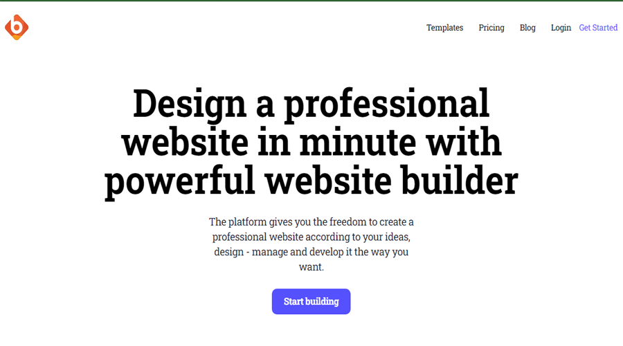
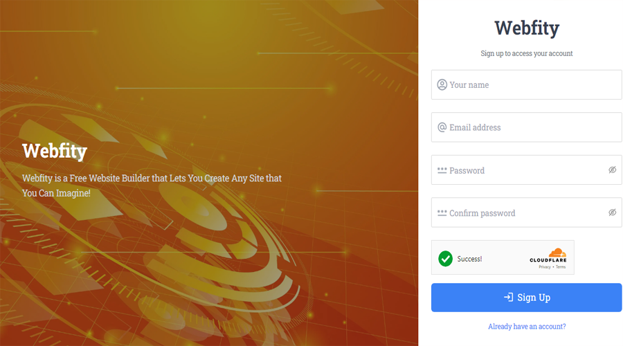
Webfity is a user-friendly and intuitive free website builder that allows individuals and businesses to create professional-looking websites without the need for advanced technical skills or coding knowledge. With its drag-and-drop interface and a wide range of customizable templates and features, Webfity makes website creation a simple and enjoyable process.
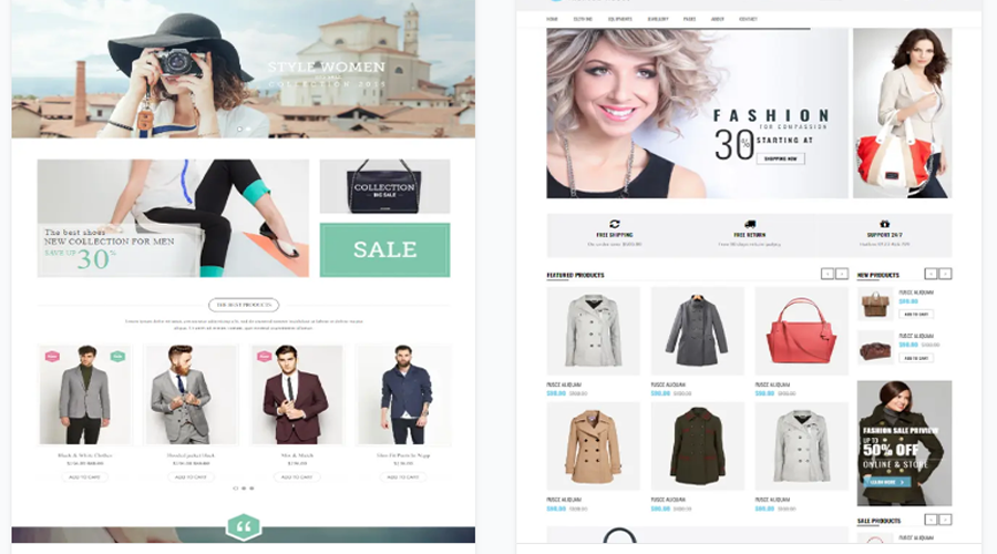
One of the key advantages of Webfity is its ease of use. Whether you're a beginner or an experienced user, you can quickly get started with building your website. The platform provides a collection of professionally designed templates that cover various industries and purposes, including business websites, portfolios, blogs, online stores, and more. These templates serve as a starting point, allowing you to customize them to fit your unique style and requirements.

The drag-and-drop functionality of Webfity makes it incredibly convenient to add and arrange elements on your web pages. You can easily insert text, images, videos, contact forms, social media integration, and other interactive components by simply dragging them onto your desired location. This intuitive approach eliminates the need for manual coding, enabling anyone to create visually appealing websites effortlessly.
Webfity also offers a variety of customization options to make your website truly stand out. You can modify colors, fonts, backgrounds, and layouts to match your brand or personal preferences. Additionally, the platform provides access to a library of high-quality images and icons, ensuring that you have the resources you need to enhance the visual appeal of your website.
Furthermore, Webfity is optimized for mobile devices, ensuring that your website looks great and functions seamlessly across different screen sizes. With the increasing number of people accessing the internet through smartphones and tablets, this feature is crucial for providing a positive user experience and reaching a broader audience.
